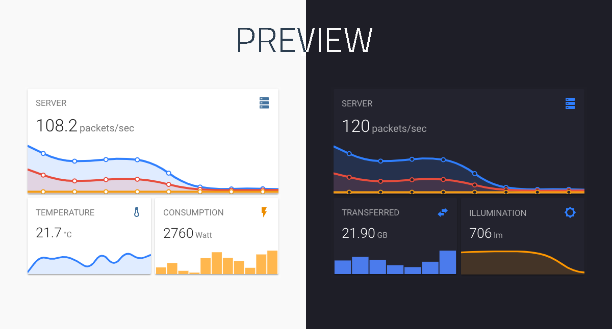
A minimalistic and customizable graph card for Home Assistant Lovelace UI.
The card works with entities from within the sensor domain and displays the sensors current state as well as a line graph representation of the history.
-
Download and copy
mini-graph-card-bundle.jsfrom the latest release into yourconfig/wwwdirectory. -
Add a reference to
mini-graph-card-bundle.jsinside yourui-lovelace.yamlor at the top of the raw config editor UI.
resources:
  - url: /local/mini-graph-card-bundle.js?v=0.6.0
type: module-
Move into your
config/wwwdirectory -
Grab
mini-graph-card-bundle.js
$ wget https://github.com/kalkih/mini-graph-card/releases/download/v0.6.0/mini-graph-card-bundle.js
- Add a reference to
mini-graph-card-bundle.jsinside yourui-lovelace.yaml.
resources:
  - url: /local/mini-graph-card-bundle.js?v=0.6.0
type: module-
Make sure you've the custom_updater component installed and working.
-
Add a new reference under
card_urlsin yourcustom_updaterconfiguration inconfiguration.yaml.
custom_updater:
  card_urls:
- https://raw.githubusercontent.com/kalkih/mini-graph-card/master/tracker.jsonIf you have a version older than v0.0.8 installed, please delete the current files and follow the installation instructions again.
-
Find your
mini-graph-card-bundle.jsfile inconfig/wwwor wherever you ended up storing it. -
Replace the local file with the latest one attached in the latest release.
-
Add the new version number to the end of the cards reference url in your
ui-lovelace.yamllike below.
resources:
  - url: /local/mini-graph-card-bundle.js?v=0.6.0
    type: module
You may need to empty the browsers cache if you have problems loading the updated card.
| Name | Type | Default | Since | Description |
|---|---|---|---|---|
| type | string | required | v0.0.1 | custom:mini-graph-card. |
| entities | list | required | v0.2.0 | One or more sensor entities in a list, see entities object for additional entity options. |
| icon | string | optional | v0.0.1 | Set a custom icon from any of the available mdi icons. |
| name | string | optional | v0.0.1 | Set a custom name which is displayed beside the icon. |
| unit | string | optional | v0.0.1 | Set a custom unit of measurement. |
| tap_action | action object | optional | v0.7.0 | Action on click/tap. |
| group | boolean | false | v0.2.0 | Disable paddings and box-shadow, useful when nesting the card. |
| hours_to_show | integer | 24 | v0.0.2 | Specify how many hours of history the graph should present. |
| points_per_hour | number | 0.5 | v0.2.0 | Specify amount of data points the graph should display for each hour, (basically the detail/accuracy/smoothing of the graph). |
| update_interval | number | optional | v0.4.0 | Specify a custom update interval of the history data (in seconds), instead of on every state change. |
| show | list | optional | v0.2.0 | List of UI elements to display/hide, for available items see available show options. |
| animate | boolean | false | v0.2.0 | Add a reveal animation to the graph. |
| height | number | 150 | v0.0.1 | Set a custom height of the line graph. |
| line_width | number | 5 | v0.0.1 | Set the thickness of the line. |
| line_color | string/list | var(--accent-color) | v0.0.1 | Set a custom color for the graph line, provide a list of colors for multiple graph entries. |
| color_thresholds | list | optional | v0.2.3 | Set thresholds for dynamic graph colors, see Line color object. |
| color_thresholds_transition | string | smooth |
v0.4.3 | Color threshold transition, smooth or hard. |
| decimals | integer | optional | v0.0.9 | Specify the exact number of decimals to show for states. |
| hour24 | boolean | false | v0.2.1 | Set to true to display times in 24-hour format. |
| font_size | number | 100 | v0.0.3 | Adjust the font size of the state, as percentage of the original size. |
| font_size_header | number | 14 | v0.3.1 | Adjust the font size of the header, size in pixels. |
| align_header | string | default |
v0.2.0 | Set the alignment of the header, left, right, center or default. |
| align_icon | string | right |
v0.2.0 | Set the alignment of the icon, left, right or state. |
| align_state | string | left |
v0.2.0 | Set the alignment of the current state, left, right or center. |
| lower_bound | number | optional | v0.2.3 | Set a fixed lower bound for the graph Y-axis. |
| upper_bound | number | optional | v0.2.3 | Set a fixed upper bound for the graph Y-axis. |
| lower_bound_secondary | number | optional | v0.5.0 | Set a fixed lower bound for the graph secondary Y-axis. |
| upper_bound_secondary | number | optional | v0.5.0 | Set a fixed upper bound for the graph secondary Y-axis. |
Providing options are optional, entities can be listed directly, see example below.
| Name | Type | Default | Description |
|---|---|---|---|
| entity | string | required | Entity id of the sensor. |
| name | string | optional | Set a custom display name, defaults to entity's friendly_name. |
| color | string | optional | Set a custom color, overrides all other color options including thresholds. |
| unit | string | optional | Set a custom unit of measurement, overrides unit set in base config. |
| show_state | boolean | optional | Display the current state. |
| show_indicator | boolean | optional | Display a color indicator next to the state, (only when more than two states are visible). |
| show_line | boolean | optional | Set to false to hide the line (see note below table). |
| show_fill | boolean | optional | Set to false to hide the fill (see note below table). |
| show_points | boolean | optional | Set to false to hide the points (see note below table). |
| show_legend | boolean | optional | Set to false to turn hide from the legend. |
| state_adaptive_color | boolean | optional | Make the color of the state adapt to the entity color. |
| y_axis | string | optional | If 'secondary', displays using the secondary y-axis on the right. |
| fixed_value | boolean | optional | Set to true to graph the entity's current state as a fixed value instead of graphing its state history. |
Note:
- If the line and points and fill are all set to false, nothing will be visible in the graph. However, the data will still contribute to the y-axis min/max and be shown in the current state and legend.
entities:
  - sensor.temperature
  - entity: sensor.pressure
    name: Pressure
    show_state: true
- sensor.humidityAll options are optional.
| Name | Default | Parameter | Description |
|---|---|---|---|
| name | true | true / false |
Display name |
| icon | true | true / false |
Display icon |
| state | true | true / false |
Display current state |
| graph | line | line / bar / false |
Display option for the graph |
| fill | true | true / false / fade |
Display the line graph fill |
| points | hover | true / false / hover |
Display graph data points |
| legend | true | true / false |
Display the graph legend (only shown when graph contains multiple entities) |
| average | false | true / false |
Display average information |
| extrema | false | true / false |
Display max/min information |
| labels | hover | true / false / hover |
Display Y-axis labels |
| labels_secondary | hover | true / false / hover |
Display secondary Y-axis labels |
| name_adaptive_color | false | true / false |
Make the name color adapt with the primary entity color |
| icon_adaptive_color | false | true / false |
Make the icon color adapt with the primary entity color |
See dynamic line color for example usage.
| Name | Type | Default | Description |
|---|---|---|---|
| value | number | required | The threshold for the color stop. |
| color | string | required | Color in 6 digit hex format (e.g. #008080) |
| Name | Type | Default | Options | Description |
|---|---|---|---|---|
| action | string | more-info |
more-info, navigate, call-service, none |
Action to perform |
| service | string | none | Any service | Service to call (e.g. media_player.toggle) when action is defined as call-service |
| service_data | object | none | Any service data | Service data to include with the service call (e.g. entity_id: media_player.office) |
| navigation_path | string | none | Any path | Path to navigate to (e.g. /lovelace/0/) when action is defined as navigate |
- type: custom:mini-graph-card
  entities:
   - sensor.illumination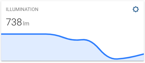
- type: custom:mini-graph-card
  entities:
   - sensor.illumination
  align_icon: left
  align_state: center
  show:
    fill: false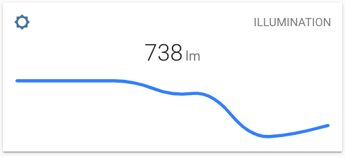
- type: custom:mini-graph-card
  name: SERVER
  icon: mdi:server
  entities:
    - entity: sensor.server_total
      name: TOTAL
    - sensor.server_sent
    - sensor.server_received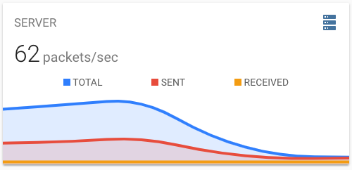
- type: custom:mini-graph-card
  entities:
    - entity: sensor.energy_consumption
  name: ENERGY CONSUMPTION
  show:
    graph: bar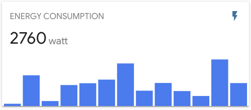
Use the hours_to_show option to specify how many hours of history the graph should represent.
Use the points_per_hour option to specify the accuracy/detail of the graph.
- type: custom:mini-graph-card
  entities:
    - sensor.living_room_temp
  name: LIVING ROOM
  hours_to_show: 168
  points_per_hour: 0.25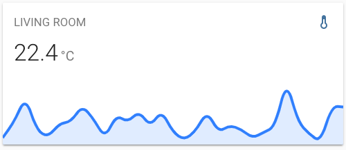
Use the show option to show/hide UI elements.
- type: custom:mini-graph-card
  entities:
    - sensor.humidity
  show:
    icon: false
    name: false
state: falseYou can stack cards horizontally by using one or more horizontal-stack(s).
- type: horizontal-stack
  cards:
    - type: custom:mini-graph-card
      entities:
        - sensor.humidity
      line_color: blue
      line_width: 8
      font_size: 75
    - type: custom:mini-graph-card
      entities:
        - sensor.illumination
      line_color: '#e74c3c'
      line_width: 8
      font_size: 75
    - type: custom:mini-graph-card
      entities:
        - sensor.temperature
      line_color: var(--accent-color)
      line_width: 8
      font_size: 75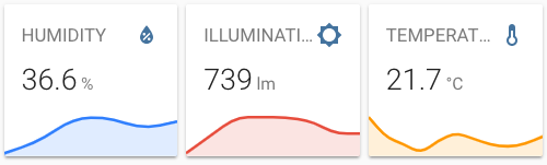
Have the graph change line color dynamically.
- type: custom:mini-graph-card
  entities:
    - sensor.sensor_temperature
  show:
    labels: true
  color_thresholds:
    - value: 20
      color: "#f39c12"
    - value: 21
      color: "#d35400"
    - value: 21.5
      color: "#c0392b"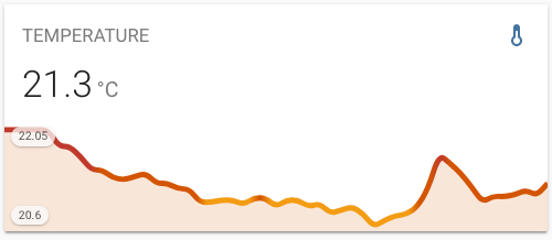
Have one or more series plot on a separate y-axis, which appears on the right side of the graph. This example also shows turning off the line, points and legend.
- type: custom:mini-graph-card
  entities:
    - entity: sensor.verandah
      name: Verandah
    - entity: sensor.lounge
      name: Lounge
    - entity: sensor.kitchen
      name: Kitchen
    - color: gray
      entity: input_number.nighttime
      name: Night
      show_line: false
      show_points: false
      show_legend: false
      y_axis: secondary
    show:
      labels: true
      labels_secondary: true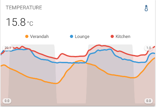
Clone this repository into your config/www folder using git.
$ git clone https://github.com/kalkih/mini-graph-card.git
Add a reference to the card in your ui-lovelace.yaml.
resources:
  - url: /local/mini-graph-card/dist/mini-graph-card-bundle.js
type: moduleRequires nodejs & npm
- Move into the
mini-graph-cardrepo, checkout the dev branch & install dependencies.
$ cd mini-graph-card && git checkout dev && npm install-
Make changes to the source code
-
Build the source by running
$ npm run build-
Refresh the browser to see changes
Make sure cache is cleared or disabled
-
(Optional) Watch the source and automatically rebuild on save
$ npm run watchThe new mini-graph-card-bundle.js will be build and ready inside /dist.
If you plan to submit a PR, please base it on the dev branch
Make sure you have javascript_version: latest in your configuration.yaml under frontend:.
Make sure you have the latest versions of mini-graph-card.js & mini-graph-lib.js.
If you have issues after updating the card, try clearing your browser cache.
If you have issues displaying the card in older browsers, try changing type: module to type: js at the card reference in ui-lovelace.yaml.
This project is under the MIT license.